


This is it: the launch of TV review season is here, and I can’t think of a better TV to kick things off than the TCL QM8L. Buckle up, grab a beverage, and settle in — you’re about to find out what this TV is really all about.
What Makes the QM8L Stand Out
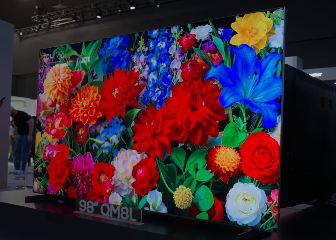
The QM8L is, in many ways and probably to nobody’s surprise, a spectacular TV. It features TCL’s new Super Quantum Dot (SQD) technology, which trickled down from the insanely spec’d out X11L TV that I reviewed (and accidentally melted) earlier this year. That’s the main headline with this TV and why we’re here: the QM8L brings SQD tech to sizes and prices that people can — and will — save up for. It has tons of local dimming zones and nearly every feature TCL could pack in. There’s definitely more than I’ll cover in this one review because it’s already going to be long enough.
I think what most of you really want to know is that this TV does a lot of things extremely well—so much so that I almost don’t have to do this review. But I do, because every TV brand claims to have a model that delivers top-tier performance at a surprising price, and the QM8L is TCL’s answer to that challenge.
What truly sets this TV apart, though, is the introduction of Super Quantum Dot (SQD) technology—a major step forward from the typical display tech you’ll find elsewhere. To help you understand why SQD matters, let’s quickly break down what makes quantum dots special and how TCL’s approach is different.
Super Quantum Dots and a New Color Filter
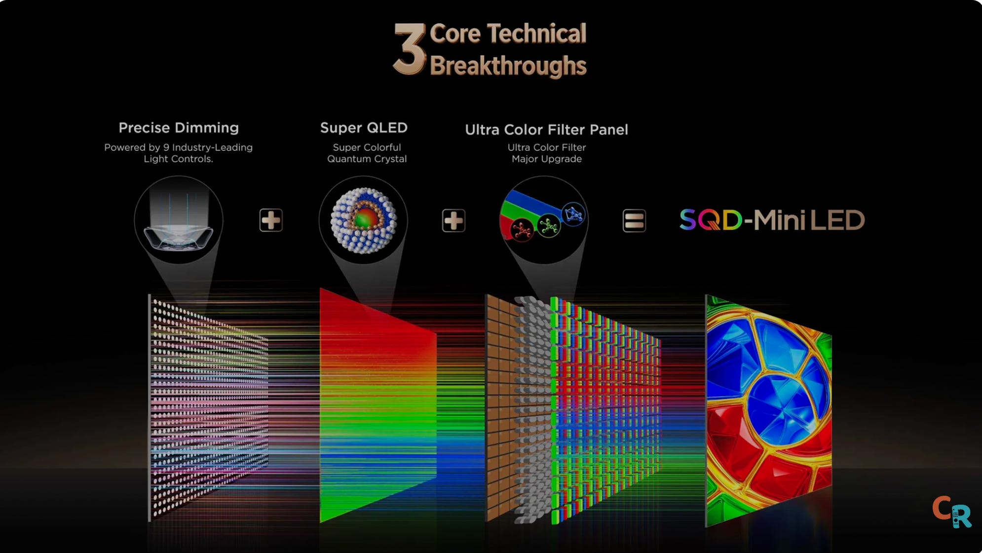
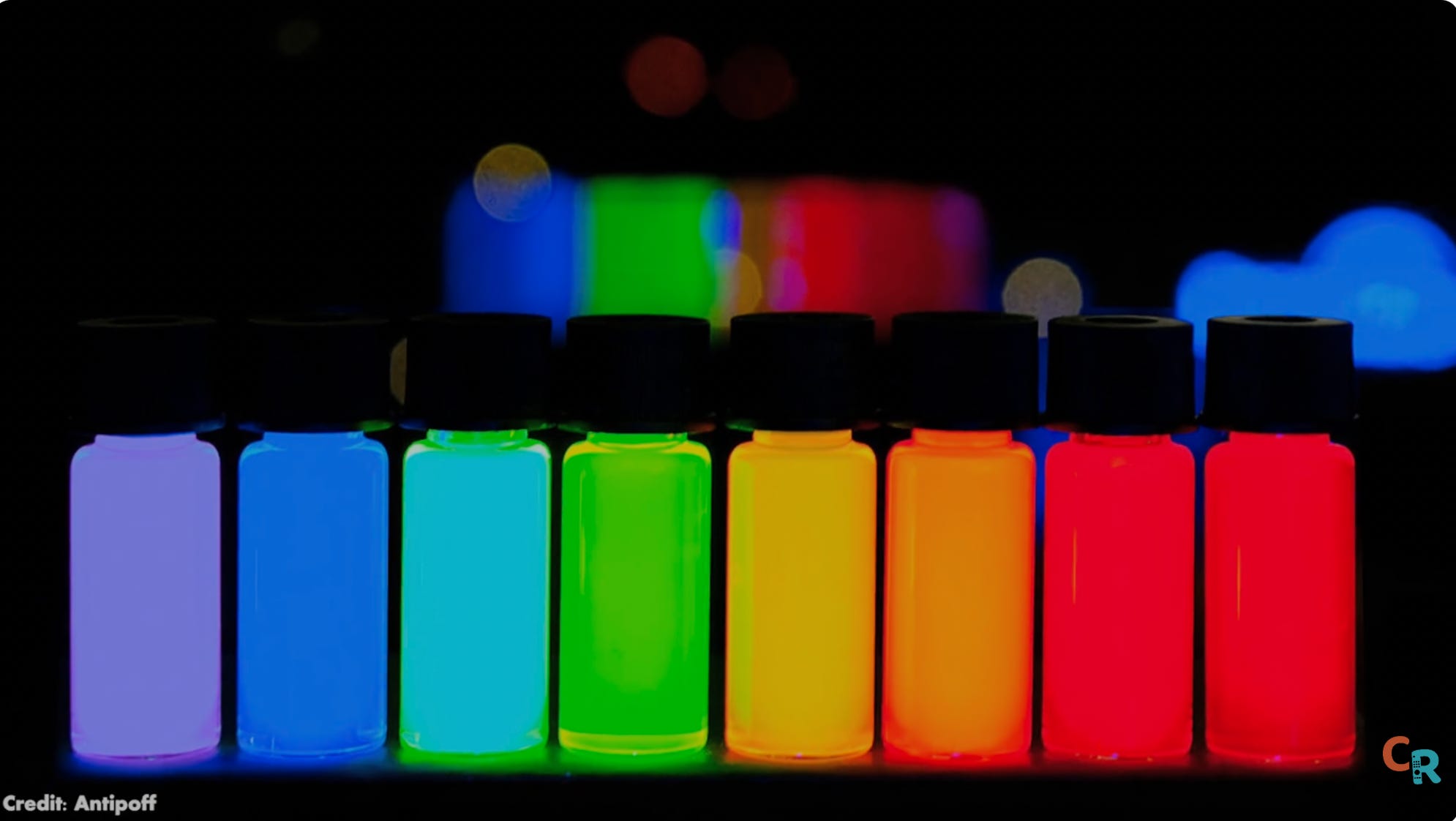
The other brands use RGB backlight technology, which this TV does not. Super quantum dots are a lot like regular quantum dots, only they are super. But I can’t explain how they are super until you understand how regular quantum dots work. Okay, so you’ve heard of QLED, QD-OLED, etc. The Q is usually short for quantum dots. Quantum dots are ridiculously tiny nanoparticles that glow a certain color when you shine light on them.
So, what TV makers do is shine blue LEDs, which are already really good, onto a sheet filled with these red and green quantum dots. And when those colors combine, they make white. But not just any shade — very pure white with a very specific balance of red, green, and blue. The better the white light, the easier it is for a color filter to remove it and produce the colors you see on your screen.
That’s why quantum dots were such a big deal when they started to appear in TVs. We started seeing colors and color brightness that we’d never seen in TVs before. Well, super quantum dots have been refined to be even purer. So, the resulting white light they help create is purer as well. So pure, in fact, that a new color filter had to be invented to handle this new super pure white light. You might not have heard of it because “the super color filter” just doesn’t sound nearly as cool. But you can’t have SQD without a super color filter. And that new color filter means even more colors than we’ve seen before at brightness levels we’ve never seen before. It’s all very impressive.


Yes, we’ve heard this story before, but this is next level. It is first-gen technology, but based on well-understood science. So, it’s less risky, both for TCL to make them and for you to buy them. This is like a turbocharged version of last year’s best TCL TVs. But the QM8L is not a perfect TV either. We need to talk about the few areas where it falls short, because whether this TV is right for you depends largely on whether it can do what you need it to.
Build Quality: Stand, Design, and Ports
Stand


So, let’s talk about the TV itself. It’s got a central pedestal stand instead of legs, so it’ll fit on smaller credenzas or tables. That, I do like. But the pedestal is made of plastic, unlike Hisense’s metal stand on its UR9. That’s something I don’t like, because the TCL TV is already really heavy, so the stand should be heavy-duty as well. Of course, if you’re going to be wall-mounting, none of that matters. But if you spend good money on a TV, it should feel premium everywhere. And the stand does not.
Ports


On the back of the TV, we have four — yes, four — HDMI 2.1 inputs. You have been clamoring for it, and now you have it. Whether anyone will actually use all of that bandwidth is another story, but they are here. They are all 4K 144 hertz inputs. Number one is the eARC port. I love that that’s the direction we’re going. I would love for the eARC audio port to be port 1 on every TV. Also on the back are Bang and Olufsen mid-bass transducers. How well do they help the sound? We’ll get there in a moment.
Design


This TV has no real bezels on the top or the sides, though there is a silver strip on the bottom. I’d prefer a gunmetal or just a straight-up black strip. To me, the silver strip won’t vibe with modern decor.
The image on the QML goes all the way to the edge. There’s no black matrix. So, the whole screen is an image. And sometimes that image is Google TV’s homepage, which is ripping-fast to navigate. Thank goodness, because as many manufacturers moved to the chipset that powers this TV and supports those four HDMI 2.1 inputs we’ve been whining about for years, it was not a foregone conclusion that the chip would run Google TV well, but it does. For me, it’s been an exceptional start-up. Even with eco mode set to low power (like off mode), it still gets up and running pretty quickly. Sorry, I didn’t time it, but it wasn’t long enough to bother me, which means it probably won’t bother you either to save a couple of bucks a month on your electricity bill by turning off that little ecoRemote Controller setting.
Remote


Now, before we start talking measurements, pretty pictures, motion, black levels, blooming, and such, let’s look at the remote. It feels like plastic. I wish it were metal, but I love it anyway because there are brightness up/down buttons on the side and a quick-menu button, which I love. There’s also a standalone button that can be programmed to launch your favorite app. TCL gave up money to give you that option rather than sell access to a particular streaming service. And for that, we thank you, TCL.
Picture Quality
Now, let’s break down the measurements. If you want to get into the weeds with me on precise metrics, I encourage you to check out my video review.
Brightness
To start, I turned off adaptive brightness in the eco settings — unless you often watch TV in rooms with highly variable lighting, I’d suggest you do the same, since it helps keep things consistent during testing.
In “filmmaker mode,” the brightness is set very low by default (19 out of 100), which might seem odd, but it’s actually pretty close to professional standards. At that setting, I measured about 239 nits — bright, but not eye-searing, and a bit more than you’d get in a totally dark studio. “Movie mode” is technically brighter (321), but the difference isn’t huge.


Gamma, which describes how the TV handles shades of gray, wasn’t perfect — the image gradually dims, then suddenly jumps to full white. This isn’t unusual, but it’s something enthusiasts might notice. In terms of color accuracy, the results were generally good, especially for an uncalibrated TV. Most colors were on point, with only the very brightest whites and some highly saturated colors being a little off. If you’re picky, calibration can fix these issues, but most people won’t notice them during everyday viewing.
One thing to note: reds and blues (and to a lesser extent, magenta) were noticeably more intense than they should be. That means some colors might look a bit too bold, which TCL could address with future updates or calibration tweaks. Overall, though, the TV’s color and brightness performance are impressive — especially for the price point.
Peak Whites
Now, let’s get into the peak white nits — the numbers that matter for real-world viewing. In my testing, the QM8L consistently reached around 4,800 nits of peak brightness, with one measurement even hitting 5,400 nits. That’s beyond TCL’s own claims and puts this TV firmly in flagship territory. For reference, the industry-standard 10% window landed at about 3,700 nits, and full-screen white measured 804 nits — enough to comfortably light a room, even in daylight.


On the color side, HDR performance tells a mixed story. While the TV delivers impressive brightness and wide color, I observed that some HDR colors were oversaturated — certain shades registered delta E values above 12, which is outside the ideal range for accuracy. In ‘Filmmaker Mode,’ where faithfulness to the creator’s intent is the goal, I would have preferred more restraint, especially for reference content. That said, these levels of oversaturation are unlikely to be obvious in typical viewing, except perhaps with skin tones or highly specific color gradations.
Color Volume
The color volume test showed the QM8L covering just under 90% of the standard, which is a strong performance for this class of TV. As for the advanced gamut ring test — the same one that famously melted a previous model — I’ll be diving deeper into those results in an upcoming SQD versus RGB analysis, since some technical details are still being confirmed with engineers.
Gamut Ring
To complete the gamut ring test, the TV required significant cooling between each of the 62 measurements, and the process took nearly two hours. The good news: the QM8L handled the stress without issue.
The main takeaway here is that even without calibration, the QM8L posts impressive numbers. With minor adjustments to white balance and grayscale, gamma performance can be further refined. For those seeking absolute accuracy, professional calibration is a worthwhile consideration that could further elevate results.
One ongoing challenge I observed is oversaturation in the blue and red primaries, along with some color errors in HDR mode. These are particularly noticeable in demanding test patterns, and while super quantum dots deliver excellent color brightness, dialing in perfect HDR accuracy remains a complex task — especially for low-luminance shades. This is an area I’ll be exploring further as I compare SQD to RGB technologies in future coverage.
Real-World Content
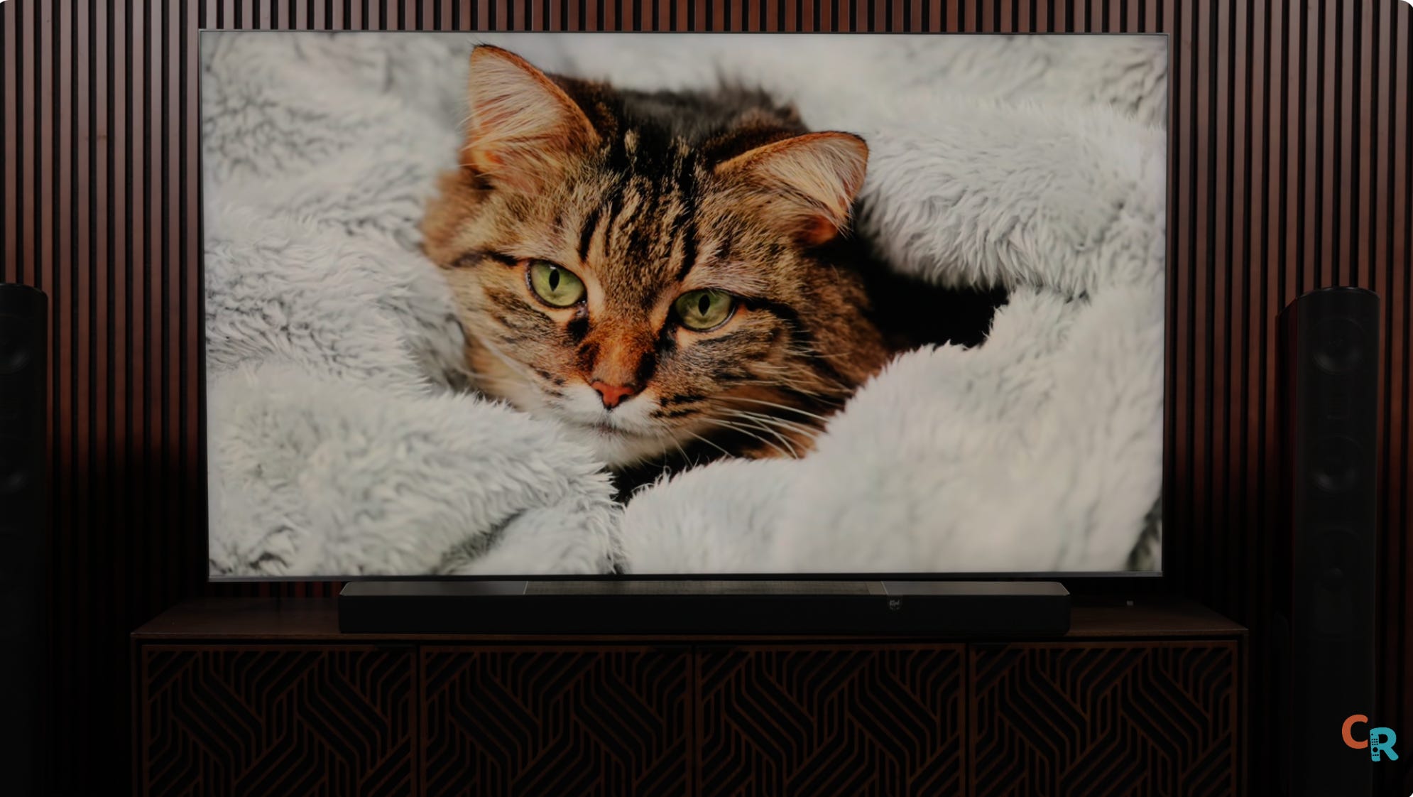
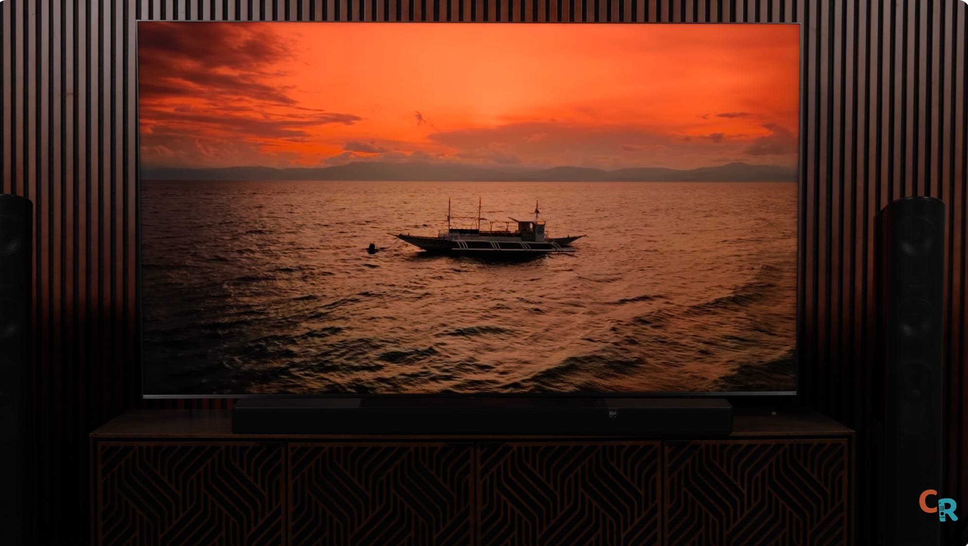
So, that’s the nerd stuff, which, as we know, doesn’t necessarily translate into a viewing experience— and that is especially the case here. This TV’s color is truly exciting to look at. When you see really green leaves or luminescent blue waters, the vibrancy is tantalizing.


Move away from the dazzling demo material, which is meant to test a TV’s limits and show it off, and you start watching everyday content. That’s where you learn what living with a TV is going to feel like in the long term. I sat down and started by watching season 1 of The Pitt and then moved on to Fly Me to the Moon, which, if you ask me, is underrated for its cinematography. I watched the last few episodes of Picard on Paramount+ (yes, I’m a subscriber), which is how I also got into several episodes of Landman — you should probably check that out. I ran the Spears and Munsil disc through the TV because I know exactly how all that content should look. I also watched both the 1080p and 4K versions of Gravity, and some Pluto TV to check the upscaling. It all looked fantastic.
Brightness management and ambient sensors
It’s nice to know you can “hit the gas and go 200 mph,” but what’s the ride like when you’re cruising most of the time? When we hear “5,000-nit TV,” we might think, “Yikes, that’s just going to be a beacon of sun in my room all the time.” And, yeah, if you want it to blast you right out of the room while watching cable, this TV can do that. But Filmmaker Mode SDR is chill, the way it’s meant to be for a dark room. You can ramp up the brightness easily with the remote for daytime, or just use the built-in ambient light sensor and not worry. It works pretty well.
AI Processing and Backlight Precision
In HDR, the TV either follows the rules or it doesn’t — and this TV, well, it’s not exactly following the rules, at least not all the time. If I change the test parameters, it can actually look dimmer in HDR than it should. The updated processor and advanced image controls in this TV sometimes handle standard test patterns differently than expected, but they generally make smart adjustments based on the type of content you’re actually watching. In typical scenes, brightness and contrast tracking appeared excellent, and overall, I was impressed with how well the TV responded to everyday movies and shows.
This TV has a lot of work to do, but I’d say its backlight control is dangerously close to the X11L’s. The X11L has insane precision, though that level of precision doesn’t benefit most people, which is why the QM8L is a far better choice for the average user. You get all that trickle-down technology from the X11L, reined in a bit for everyone but the ultra enthusiast, for a real-life flagship that outperforms its predecessor by a significant margin — in some cases, for less than last year’s QM8K.
Motion handling and upscaling
Motion handling is better on this model, with less stutter even before turning on any motion smoothing. You get less ghosting when you crank up motion interpolation, though by its nature, that’s a system bound to create flaws, not fix them. Upscaling and cleanup of older, lower-resolution or lower-bit-depth content have definitely improved — the picture is just cleaner overall.
Console and PC Gaming Performance
The QM8L is an outstanding TV for watching shows and movies. If you’re gaming with a console, you’ll love using it here. Input lag varies with resolution and refresh rate, but TV companies have done a good job of mitigating it while preserving decent picture quality. For most console gamers, it’s a big thumbs-up for high-framerate content. PC gamers, keep in mind: TVs are not, by nature, made like monitors. The TV has to handle all image processing and graphical rendering, so it won’t perform like a monitor that just passes the signal from a high-end graphics card. Enjoy the 144Hz frame rate capability, but don’t expect this TV to beat your high-end PC gaming monitor. That’s why those smaller, high-end monitors cost so much—because they do things equally priced TVs can’t.
Audio
As for the audio, the QM8L TV sounds … okay.
I can count on one hand the number of TVs with sound I found impressive Sony’s recent OLED TVs — which use the screen as speakers — Sony’s X900B (launched in 2014), which had an array of speakers flanking the sides of the screen. almost universally denounced as atrocious-looking (unsightly as it may have been, it sounded great), and Panasonic’s fairly recent Z95B, which had a soundbar strip tacked on below the screen.
To me, everything else sounds mediocre at best. And that’s not just my inner audiophile speaking. If your speakers aren’t aimed at your head, you are fighting physics. No DSP magic or acoustic sleight of hand can override the fundamental laws of sound discovered by giants like Pythagoras, Galileo, and Newton.
The best thing I can say about the QM8L’s sound is that it is fairly warm (not harsh), dialog is intelligible without being chesty, AND you can now add a wireless subwoofer to the TV to lend some sizeable sound commensurate with the size of the screen.
Attainable Premium Picture Quality
The X11 is fire, but I’m not going to recommend it to any of my friends. That’s a TCL flex model, showing what the brand can do. If you’ve got X11L money and obsess over top performance, go for it. The folks I hang out with — friends, family, some referrals from each — I’m going to tell them to save up and get the QM8L later this year when the price comes down. Once prices do drop, watch out.
This TV is one of the best ways to get ultra-premium picture quality at an attainable price point. Note, I did not say affordable — that’s up to you, and how you spend or save your money — but it is attainable. There’s not much I dislike about watching this TV, other than the Netflix red looking off to me, or the YouTube logo’s red looking wrong. There are times in actual content — like intense flames in Mad Max: Fury Road — where some colors seem a bit overcooked. It’s the only thing that occasionally took me out of the immersion. So, sure, there’s room for improvement, but I don’t see any deviation from TCL’s core principles of delivering insane picture quality for the money you pay.
Price Comparison
For price comparison, the 65-inch QM8L came in $500 less than the QM8K and is currently available for $1,800. The 75-inch is $200 less, but TCL knows the popular size now is 85 inches, and that model is $500 more expensive. If you want the 98-inch size, that’ll be $1,000 more, and you can get it right now for $5,000.
Final verdict
I’m looking at the TCL QM8L and thinking, “Hell yeah, that’s a fantastic TV that probably shouldn’t be as good as it is.” TCL made some smart decisions and came out with an overachiever that punches dangerously close to its moonshot TV, but offers meaningful performance improvements over the QM7L step-down model. I suspect the QM7L will end up being the TV most folks should buy, but for now, the QM8L is a top-five TV this year. I don’t know which category it’ll grab, but it’ll be up there — probably the smartest move for the money. We’ll see how that holds up by the end of the year, but this won’t be the last you hear from me about the QM8L.
Community Q&A
Before we go, I want to answer some specific questions we gathered using a data model built by my team at CE Critic. You can also visit CE Critic, which is among the most respected reviewers (full disclosure: I am an executive partner at CE Critic). Here are some quick answers:

Is the QM8L using a new processor chip, or is it the same as last year?
Yes, it has a new SOC, which means some reprogramming and a new processing name, pointing to new tricks even if based on prior language.
Did TCL fix motion processing issues from last year?
Yes, motion processing is improved. It’s a bit better, though I’d argue the QMAK wasn’t bad to begin with. TCL is creeping up on Sony — actually, not quite there yet, but getting closer every year. Interpolation artifacts are hard to remove because they create fake pixels, which is a tough engineering challenge. Stutter on sports shouldn’t be a thing unless motion smoothing is on, and even then, ghosting is more likely. I haven’t watched baseball on this TV yet, but it’ll be in that versus video I mentioned. Low bitrate streams — well, you can’t put lipstick on a pig and call it a runway model, but the TV does well cleaning up dirty content.
Any improvements to blooming?
There weren’t major blooming issues with the QM8K, and for the price, it was one of the best-controlled TVs on the market. Remember, the brighter an object is, the more your eyes will see a halo. Try watching closed captions in the letterbox bars of a movie and see if the bottom half of the screen lights up — I don’t think you will.
Does the crazy brightness improve HDR colors and black levels?
Black levels don’t have much to do with SQD. There’s still some loss of shadow detail at extremely low (5%) stimulus levels. You can fix that for gaming, but your contrast will look a little more washed out — that’s an LCD thing. HDR color has expanded, and the gamut rings test shows that while it may not reach the furthest BT2020 extremes, it covers every color at every brightness level, right up to the edge.
Did TCL improve accuracy out of the box?
Not with my review unit, but other reviewers are reporting improvements. Is the QM8L actually different from the QM851G from two years ago? Yes, vastly different. The ultra-wide-angle viewing filter alone is notable, and SQD takes things to the next level.
How close is the QM8L to OLED?
I have a whole video on why OLED LCDs can’t beat certain aspects, but I’d say the QM8L is second in line so far, behind the X11L. Other TVs may soon give it a run for its money.
Is this TV range still a good value? Without question, yes. Check the price differences I mentioned earlier, and I think you’ll agree.
Great review as always. I'm annoyed by TCL's lead graphic at the top. It shows a layer of white mini-LEDs (they should be blue) then a rainbow of "QLED" (should just Q and it should be all white) and then the color filter which appears to be the only accurate part of the diagram.
I guess that's why we need Caleb!